CMYK curated by Rhea Clements
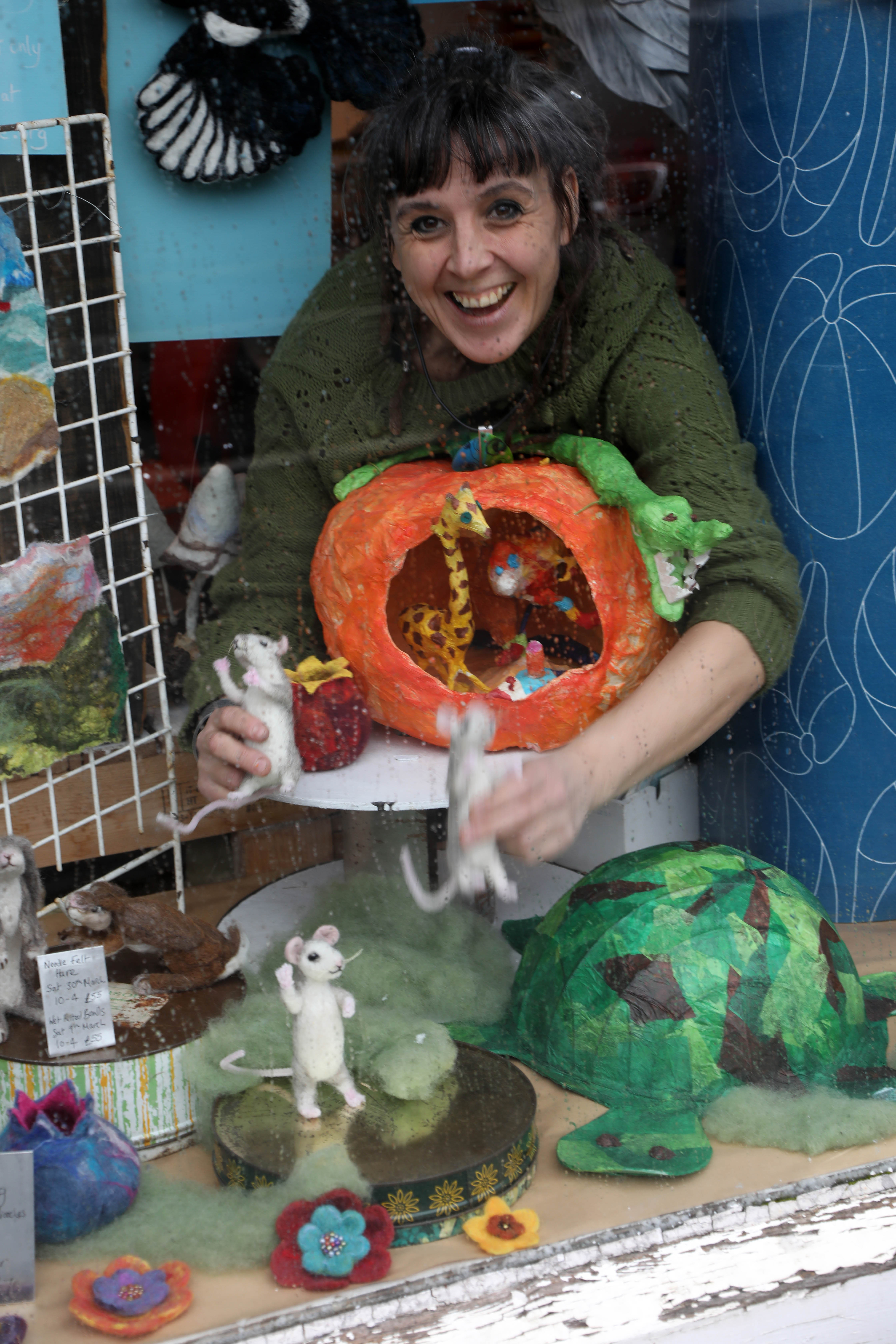
I want to thank Rhea for curating this exhibition and all the hardwork she’s put in. It’s been great handing over the organisation to someone else and seeing what materialises. The quality of work in this exhibition is excellent and combines well established makers with emerging artists. Rhea also created the logo and poster which captured the look and feel of the exhibition, crisp, colourful and professional. That said, the proof of it’s success is in people’s response to the exhibition, you can get a glimpse from the pictures, but better still come along and see the exhibition for real! At The Making House Fridays and Saturdays 10 – 5pm until 8th June or other times by arrangement.
I wanted to find out more about Rhea’s new found love of colour and how she found curating the exhibition.
You’ve completely embraced colour in your work; how and why did the change come about? Has it changed your design process?
I have always loved colour but didn’t have the confidence to use statement colours. I felt that as my products are unusual I should use safer more muted colours. But after spending time doing events and getting customer feedback I started to think I should embrace customers who want to make a statement.
I think the biggest impact to my work changing was a holiday. I had not been on a holiday for about 8 years and as all self employed people know it is very hard to switch off from your work. A day off usually consists of trying that new design you have been wanting to try or catching up on paper work. So me my partner went to New York and Boston last spring. The whole build up to the holiday I was worrying about getting behind in my work but once we were there I was put in a position where I had no choice but to do no work and relax, and I loved it! I came back completely refreshed and full of new ideas and more confidence to be more bold with my product through colour. It surprised me how much a holiday did!
I also can’t deny being inspired by trends. More and more you are seeing high street shops using statement colour in their displays and products. I think we may be coming to a point where we are getting bored of the grey wardrobe along with the grey weather and want colour!
The exhibition is about ‘the visual impact of colour’ People relate to colour in very different ways; what does that mean for you?
For me colour effects my mood. I find I am a lot happier when surrounded with colour. And since changing my colours and brand I have had the same feed back from the public. At events I get so many lovely comments from customers who cannot help but smile when they get to my colourful stand. I also find on my blog and facebook where I share colourful images that I find inspiring make my followers happy.
For more information on Rhea’s work visit www.rheaclements.co.uk
For more information on the artists visit:
http://louisewrightdesign.com, www.katiestainer.co.uk, www.ruthsinger.com, www.clareshrouderillustration.com, www.emmalearoyddesign.co.uk, www.jcmiddlebrook.co.uk, www.fizgig.co.uk, www.muchado.biz

1 Comment »